Reducing Discovery Friction
D&D Beyond | Product Designer
Executive Summary
D&D Beyond houses massive libraries of game content, but its browsing experience was optimized for users searching for something they already knew existed—not for users trying to explore options and make decisions.
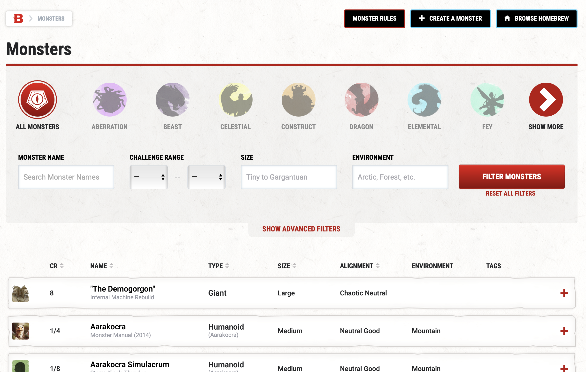
This created significant friction for high-value users, particularly who often needed to quickly compare large sets of content while planning games. Important filters were buried, irrelevant filters were prioritized, and users frequently had to click in and out of detail pages just to compare options.
I identified that this wasn’t a traditional content discovery problem—it was a productivity problem. By reframing the experience around faster evaluation rather than simple retrieval, I redesigned the browsing model to help users filter, compare, and make decisions without constantly losing context.
The result was a significantly faster workflow, lower time-on-task in testing, higher task completion, and a reusable model that influenced broader platform thinking.
The Problem
D&D Beyond serves a wide range of users navigating an enormous amount of information. New players are often learning game systems for the first time, experienced players are optimizing character builds, and all are generally searching for game resources.
Despite these different needs, users often encountered the same friction: browsing large content libraries took too much effort.
The issue wasn’t access to content. It was the speed and confidence of evaluation. Users struggled to quickly compare options, identify useful filters, and understand meaningful differences between pieces of content without repeatedly clicking into individual pages.
The platform enabled browsing, but it slowed decision-making.
That friction affected both newer users, overwhelmed by volume, and experienced users trying to move quickly through complex datasets.
The Process
As I studied the problem, I realized this feature wasn’t reflective of users’ mental model, nor was it optimized to accomplish the tasks for which it was set.
Users were trying to complete highly task-driven comparison work, discovery, and quick reference and the platform was slowing them down. That reframing immediately pointed toward interaction patterns that had already solved similar problems well in productivity tools.
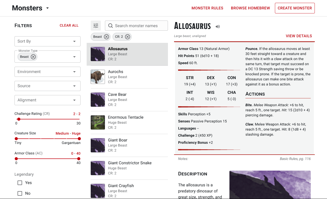
I intentionally borrowed a familiar multi-panel model similar to tools like Apple Mail, allowing users to browse results, filter datasets, and review detailed content simultaneously without losing their place.
This shift fundamentally changed the experience from drilldown-based retrieval to continuous evaluation.
I also redesigned filter behavior by surfacing all filters in a dedicated panel, improving labeling clarity, introducing filter chips, and using more intuitive controls like toggles and sliders.
Results & Learnings
The redesigned experience fundamentally changed how users interacted with large content libraries by reducing the friction between browsing and decision-making.
Users could now filter datasets more easily, browse results without losing context, and compare detailed options side-by-side instead of repeatedly navigating between pages. On desktop, the multi-panel layout created a more efficient evaluation workflow, while mobile preserved the same logic through progressive panels that maintained hierarchy without overwhelming smaller screens.
The redesign also improved the filtering experience by surfacing more relevant filters, making them easier to discover, clarifying labeling, and introducing controls that felt more intuitive for the type of decisions users were making.
We validated the redesign through unmoderated testing. Compared to the previous experience, users completed tasks faster, showed high completion rates, and demonstrated significantly less confusion when navigating filters and evaluating options.
The project also became an early proving ground for broader design-system thinking. It helped push the team toward more utility-driven interface patterns that prioritized task completion without losing the product’s visual identity.